Avoid Costly Reprints: 5 Proofing Steps for RGB vs CMYK T Shirts
Follow a five step workflow to avoid color surprises when sending RGB art for t shirt printing: use ICC soft-proofs, request test prints, and choose spot...
Avoid Costly Reprints: 5 Proofing Steps for RGB vs CMYK T Shirts
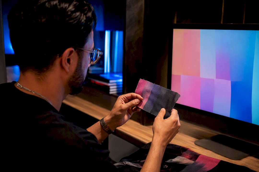
Submit CMYK for your final print file. A large majority of shirt printing problems trace back to a designer sending an RGB file and hoping for the best. The one exception: some sublimation shops run RGB workflows through their own ICC pipeline, but even then, ask for a soft-proof before you approve anything. Request a proof, always, before a full run gets printed.
TL;DR:
- Sending RGB files instead of CMYK is the most common cause of shirt printing issues, and converting files properly before printing is crucial.
- Expect neon and saturated colors to appear duller after converting to CMYK, especially if exact brand colors are involved; spot colors or Pantone matching are better options.
- Direct-to-garment printers accept RGB but convert automatically, which can produce unexpected results, so submitting a CMYK file gives more control.
- Always request a digital proof and a physical test print, especially for color-critical designs or fixed brand colors, to prevent costly reprints.
- Proper soft-proofing against the correct ICC profile costs only a few minutes and significantly reduces the risk of color discrepancies in the final print.
Table of Contents
- RGB vs CMYK for Shirt Printing: The Quick Reference
- Why Colors Shift: Additive Light vs Subtractive Ink
- How Printing Method Changes What You Should Submit
- File Prep and Proofing: The Workflow That Actually Works
- Fixing the Five Color Problems That Show Up Most
- What a Print-Ready Checklist Looks Like
- Why Most Color Complaints Are Preventable
- Get Your Colors Right the First Time
- Sources
RGB vs CMYK for Shirt Printing: The Quick Reference
RGB stands for red, green, blue. It is light. Your monitor, phone screen, and camera all build color by mixing colored light, which is why RGB can produce blazing neons and electric blues that look incredible on a laptop screen.
CMYK stands for cyan, magenta, yellow, and key (black). It is ink. Printers lay down physical pigment on fabric, and pigment simply cannot reproduce every color light can make. That gap is the entire reason RGB vs CMYK matters for t-shirt printing instead of being a footnote in your software’s export menu.
Here is what that means in practice:
- Design and preview mockups in RGB. It is the native mode for Photoshop, Canva, and every screen you’ll show a client.
- Convert to CMYK before you send the final file to any printer, no exceptions for process printing.
- Expect neon greens, hot pinks, and saturated blues to look slightly duller once converted. That shift is normal, not a printing mistake.
- If your design leans on one exact brand color, flag it early. Spot-color options exist for that problem.
Why Colors Shift: Additive Light vs Subtractive Ink
RGB is additive. Start with black and add red, green, and blue light, and you build toward white. It is how a projector or a screen behaves.
CMYK is subtractive. Start with white paper or fabric and subtract light by layering ink, moving toward black. That fundamental difference sets the outer limit, or gamut, of what each mode can represent. RGB’s gamut is bigger, especially in the neon and highly saturated range, which is why a lime green that pops on-screen often reads as a muted olive once it hits cyan, magenta, yellow, and black ink.
For most photographic or full-color artwork, converting to CMYK and accepting some gamut loss is the standard move. But when a design depends on one specific, unchangeable color, like a corporate logo blue, process CMYK printing is the wrong tool entirely. That’s where Pantone textile color systems come in. Pantone (PMS) assigns a numbered code to a specific ink mix, so “PMS 286” prints the same blue whether it’s on a business card or a hoodie. For screen printing especially, matching to a Pantone number removes the guesswork process CMYK can’t avoid.
How Printing Method Changes What You Should Submit
The color mode question doesn’t have one universal answer. It depends heavily on how your shirt actually gets printed.
Direct-to-Garment (DTG) printers are inkjet machines that print CMYK-based files directly onto fabric. Most DTG software accepts RGB and converts it automatically, but that automatic conversion is exactly where surprises happen, especially with vivid or neon artwork. Submitting a CMYK file yourself gives you control over the outcome instead of leaving it to software defaults.
Screen printing typically uses spot color inks mixed to Pantone specifications, or a limited CMYK process for full-color jobs. It excels at solid colors and precise brand matching, which is why most logo shirts and team gear use it.
Sublimation uses dye that bonds with polyester fibers under heat. It often reproduces vibrant color close to what screen printing achieves, but it only works well on light or white polyester fabric, which limits substrate choice.
Heat transfer vinyl (HTV) and DTF transfers handle solid colors well but can struggle with smooth gradients and ultra-bright neons depending on the ink set.
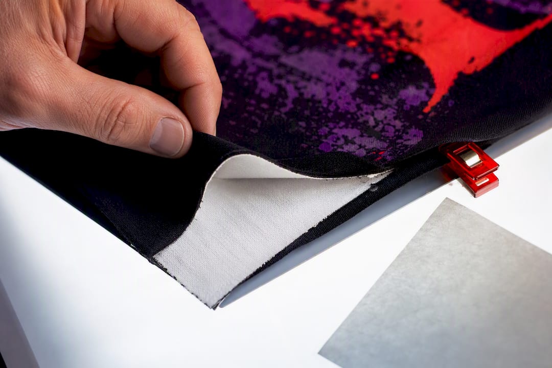
One factor cuts across every method: fabric color. Printing on a dark shirt requires a white underbase, a layer of white ink or transfer material printed first so colors show up true. That underbase can slightly shift how a color reads once dry, which is worth planning for before you finalize a design for a black or navy tee.
File Prep and Proofing: The Workflow That Actually Works
Getting from a finished design to an accurate print run comes down to five steps, done in order.
- Pick the right file type first. Logos and line art belong in vector formats like AI or EPS, since they scale cleanly and hold color precisely. Photographic or gradient-heavy art should export as a high-resolution CMYK PDF or TIFF.
- Convert using an ICC profile, not simple math. A basic RGB-to-CMYK formula converter guesses. An ICC-based converter simulates how a specific press, ink set, and substrate will actually render your colors, which produces a far more accurate result.
- Soft-proof against the printer’s actual profile. Standards like SWOP and GRACoL are common in North America, and FOGRA is standard across Europe. Ask your print shop which profile they use, because soft-proofing against the wrong one gives you a false sense of accuracy.
- Adjust problem colors manually. If a color looks flat after conversion, nudge saturation or hue in CMYK mode directly rather than re-exporting from RGB and hoping.
- Request a digital proof, and for anything color-critical, order one physical test print before committing to a full run.
Pro Tip: Never approve a bulk order based on a screen preview alone. Screens and fabric render color completely differently, and the only proof that matters is one printed on the actual material your run will use.
Our print-ready artwork guide walks through file formats and resolution requirements in more detail if you’re prepping your first submission.
Fixing the Five Color Problems That Show Up Most
Most color complaints after printing fall into a small, predictable set of issues.
- Neons and electric colors look muted. These fall outside CMYK’s gamut entirely. Pick the nearest printable equivalent, or move to spot/neon inks if your printer offers them for screen printing.
- Blues and greens look dull or shifted. This is common after a straight conversion. Bump saturation slightly in CMYK and soft-proof again before finalizing.
- Black looks gray or thin. Pure RGB black (0,0,0) often converts to a weak, flat CMYK black. Ask for a rich black ink recipe instead, which layers additional cyan, magenta, and yellow under the black channel for real depth.
- Colors look washed out on dark shirts. This usually means the white underbase needs adjustment. Our dark shirt printing guide covers the specific checks worth running before a dark-garment order.
- Nothing you try fixes it. At that point, stop guessing and order a proof. A five-minute conversation with your printer solves more color problems than an hour of trial-and-error in Photoshop.
Pro Tip: If a proof looks off, ask your printer what ICC profile and rendering intent they used. That one question usually reveals whether the issue is your file or their setup.
What a Print-Ready Checklist Looks Like
A file that survives the trip from screen to shirt without surprises follows the same short checklist every time: convert to CMYK, soft-proof against the printer’s ICC profile, request a digital proof, and order one physical test print for anything color-critical, like a brand logo or matched team color.
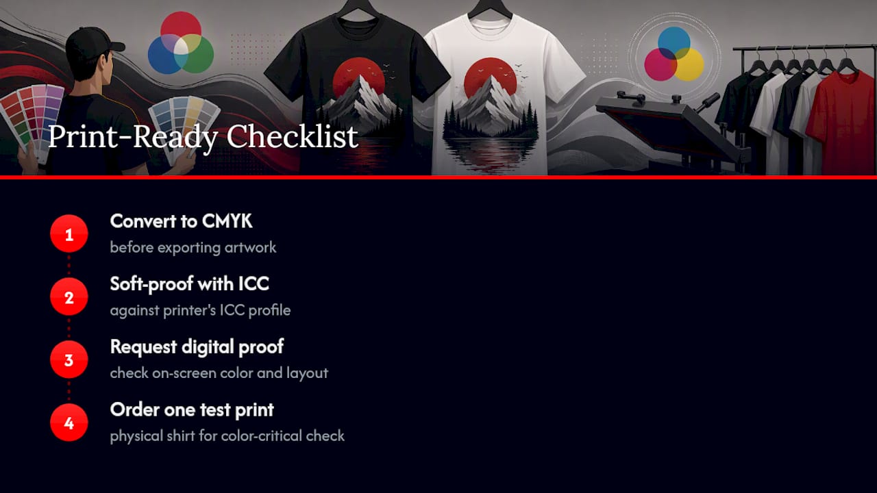
That last step matters more than most designers expect. A single test shirt costs little compared to reprinting fifty units in the wrong shade of blue. If you’re ordering for a team or event rather than one shirt, our single shirt printing options guide explains how to get that one proof print before committing to volume. For DTG and DTF-specific prep, the full-color design guide covers method-specific quirks worth knowing before export. And if you’re managing a bulk uniform order, Capra Sports’ breakdown of how custom uniforms move from mockup to delivery is a useful look at how approval stages work on the production side.
Why Most Color Complaints Are Preventable
The conventional advice on this topic stops at “convert to CMYK before printing,” and that’s true but incomplete. The real failure point isn’t the color mode. It’s skipping the proof step because it feels like an extra delay or an extra cost.
A soft-proof against the correct ICC profile takes minutes. A physical test print takes a day or two and a small amount of material. Compare that to reprinting a hundred shirts because the blue came out wrong, and the math isn’t close. Designers who treat proofing as optional are the ones who end up disappointed, not the ones who chose the wrong file format.
The other overlooked piece: Pantone matching gets treated as something only big brands need. In reality, any shirt with one fixed, must-match color, a school crest, a company logo, a sports team’s exact shade, benefits from spot-color printing over process CMYK. It costs a little more attention upfront and removes the single biggest source of color disappointment on delivery day.
Get the proof. Ask about the profile. Skip nothing.
— Toronto
Get Your Colors Right the First Time
Guessing at CMYK conversions on your own software is how good designs come back looking wrong. Some custom t-shirt printing services build proofing into the process instead of treating it as an upsell: every order can include a digital proof, and color-critical jobs can get a physical test print before a full run goes to press, whether that’s screen printing, DTG, or DTF transfers.
Some custom t-shirt printing providers offer print-ready artwork support directly, so if your file needs converting, adjusting, or checking against the right ICC profile, that’s part of the service, not a separate step you have to figure out alone. Local pickup and shipping options are often available for teams, events, and businesses that need consistent color across every shirt in the run.
Start your order through our Toronto custom t-shirt printing page, and request a soft-proof and test print before you approve a bulk quantity. Running a larger order? Our bulk printing options include the same proofing steps, scaled for team and corporate quantities.
Sources
Recommended
Get pricing in 24h.
Toronto-based, no minimums. Tell us about your project and we'll email a detailed quote within one business day.
Request a Quote