Printer Ready Checklist: Proof vs Mockup for Designers & Print Buyers
Production minded guide for designers and print buyers: when to use mockups vs proofs, plus a printer ready approval checklist to avoid costly reprints.
Printer Ready Checklist: Proof vs Mockup for Designers & Print Buyers
A mockup shows how something will look; a proof verifies how it will print. If you’re pitching a design concept or showing a client what a shirt or box might look like, you need a mockup. If you’re about to send artwork to press and need to confirm color, layout, and text before hundreds of units get printed, you need a proof. Get this backward and you either waste time on unnecessary approvals or, worse, approve a run that comes back wrong.
TL;DR:
- Using a mockup early in the process provides visual feedback on concept, while proofs ensure color, layout, and material accuracy before printing.
- Soft proofs are quick and inexpensive but less reliable for color-critical jobs, which require hard or contract proofs for precise verification.
- A rough mockup fosters honest critique, whereas professional proofs, including physical or digital versions, safeguard against costly production errors.
- Final proof approval should follow a systematic checklist, emphasizing color consistency, layout accuracy, and proper sign-off documentation.
- Relying solely on mockups and skipping proper proofing increases the risk of reprints, delays, and extra costs, especially on large or color-sensitive print jobs.
Table of Contents
- Proof vs Mockup: Clear Definitions and Examples
- Proof Types in Printing: What Each One Actually Checks
- Mockup Varieties: Choosing the Right Fidelity
- When to Request a Mockup vs When to Require a Proof
- The Printer-Ready Proof Approval Checklist
- Common Mistakes and Pro Tips From the Print Floor
- How Proofing Actually Cuts Down Reprints
- Mockup, Prototype, or Proof: Untangling the Three
- Tools Designers and Printers Actually Use for Mockups and Proofs
- Industry Standards and Best Practices for Proofing
- Reading Feedback and Revisions on Proofs and Mockups
- Where to Go From Here
- The Real Gap in How People Think About Proofing
- Sources
Proof vs Mockup: Clear Definitions and Examples
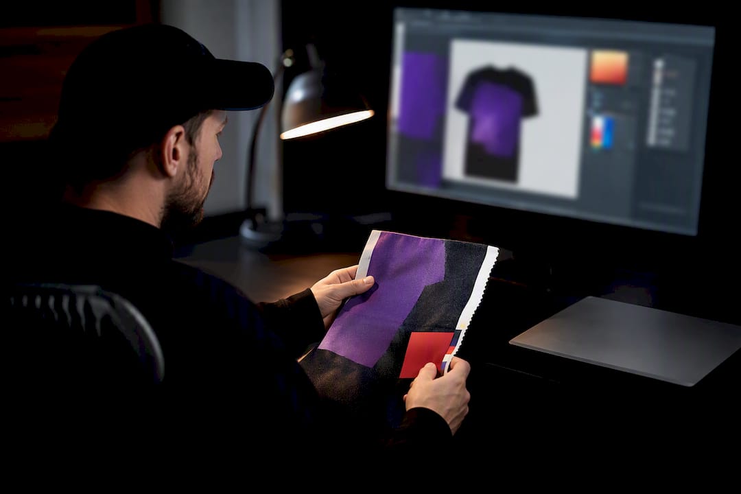
A mockup is a visual preview of a design, usually before it exists in physical form. Think of a t-shirt design dropped onto a digital template through a smart object in Photoshop, or a packaging render shown from three angles. It answers one question: does this look right conceptually?
A proof is a production check. It confirms that what gets printed matches what was approved, down to color values, trim lines, and font rendering. Proofs come in several flavors, covered in detail below, but they all share one job: catching problems before the press runs.
A prototype sits in a different category entirely. Where a mockup and proof both deal with appearance, a prototype validates function and behavior — think a working app screen you can tap through, or a garment sample you can actually wear and stretch. Mockups answer “does this look right?” Prototypes answer “does this work as intended?”
- Mockup example: a digital hoodie template showing your logo placement before ordering
- Proof example: a PDF soft proof showing exact CMYK values for a business card run
- Prototype example: a wearable sample garment used to test fit and fabric behavior
Proof Types in Printing: What Each One Actually Checks
Not every job needs the same level of verification, and printers use four main proof types to match the check to the risk.
- Soft proof. Viewed on a calibrated monitor, this is the fastest and cheapest option. It’s good for catching layout errors and gross color mistakes, but it can’t guarantee exact ink-on-paper color.
- Hard proof (color proof). A printed simulation of the final piece, useful for anything where color accuracy actually matters, like brand logos with specific Pantone values.
- Contract proof. A legally binding agreement on color between printer and client. Once signed, it becomes the reference standard the press run is measured against.
- Press proof. An actual test run on the production press itself. It’s the most expensive and slowest option, but it’s the only one that shows exactly how ink behaves on that specific press and substrate.
Prepress proofing exists specifically to catch errors before press time, because press time is the most expensive stage of the entire print process to fix a mistake in. A soft proof is convenient and cost-effective, but it can’t fully emulate how ink will actually behave on paper or fabric, which is exactly why color-critical jobs skip straight to hard or contract proofs.
Mockup Varieties: Choosing the Right Fidelity
Mockups aren’t one-size-fits-all, and picking the wrong fidelity level wastes time in both directions.
- Digital flat mockups. Smart object PSDs or PNG overlays that drop your artwork onto a template. Fastest option, ideal for quick internal review or client sign-off on concept direction.
- 3D or constructed mockups. Physical models or rendered 3D files that show how a design wraps around a real object, critical for packaging, boxes, or anything with dimension and folds.
- Live product previews. Staged photos or on-model shots used for marketing approval, showing how the finished product will actually present in a catalog or social post.
Here’s a detail most people miss: a rough, low-fidelity mockup often gets you better feedback than a polished one. Design ops teams have found that showing an overly polished mockup too early can signal “this is basically done” and suppress critical feedback, while a rougher version invites people to actually critique it. If you’re still deciding on layout or placement, resist the urge to make your first mockup pixel-perfect.
When to Request a Mockup vs When to Require a Proof
The decision usually comes down to what stage you’re at and how much risk the run carries.
- Early creative review. Use a mockup. You’re testing concept and direction, not confirming production specs.
- Prepress sign-off. Require a proof. Once the design is locked, you need to verify the file will print as intended.
- Packaging and dieline-sensitive projects. Combine physical mockups with proofs. Complex substrates and folded structures often need constructed mock-ups plus multiple proofing passes because geometry changes how a flat design reads once it’s assembled.
- Small, low-risk runs. A soft proof is often enough, especially for internal materials or short-turnaround jobs where minor color drift won’t hurt the outcome.
- Large or color-critical runs. Insist on a hard or contract proof. The cost of a proof is nothing compared to reprinting a few hundred units in the wrong color.
Every step up in proofing rigor adds time and cost, but it buys certainty. A soft proof might turn around in minutes; a contract proof can add a day or two to your timeline. For bulk orders, that extra day is almost always worth it compared to the alternative: rerunning an entire batch.
The Printer-Ready Proof Approval Checklist
Before you sign off on any proof, run through these categories. This is the same order most experienced print buyers work through, and skipping a step here is where reprints come from.
- Color. Request a CMYK preview, confirm any spot-color names match the job ticket, and hold the proof next to your actual brand swatch.
- Layout. Check trim marks, bleed, margins, page order if multi-page, and confirm image resolution didn’t get downsampled somewhere in the file chain.
- Text. Read every word for spelling, verify font substitutions didn’t happen, and check kerning on headlines where it’s most visible.
- Material and finish. Confirm the substrate (paper stock, fabric type, coating) matches spec, and request a hard proof if the finish affects how color reads.
- Sign-off. Know who has authority to approve, understand that a signed proof authorizes the run “as-is,” and keep the signed file archived with a date and version number in case of disputes later.
A printer’s proof helps confirm color, layout, text, and material choices before a large run goes to press, which is exactly why this checklist exists in roughly this order: catch the expensive stuff (color, material) before the cheap stuff (spelling) becomes the reason you missed it.
Pro Tip: Never approve a proof over email thread comments alone. Get one clean, dated file with visible sign-off, even if it’s just a reply confirming “approved as shown” attached to the actual proof. Verbal or scattered approvals are the number one reason disputes happen after a run ships.
Common Mistakes and Pro Tips From the Print Floor
The single biggest mistake we see: treating a mockup as if it were color-accurate. It isn’t, and it was never meant to be. A mockup shown on a laptop screen under office lighting tells you nothing reliable about how a Pantone-matched logo will print on cotton.
- Don’t approve artwork with missing dielines or fonts that aren’t embedded. Both cause silent failures that only show up after printing.
- Don’t skip a hard proof on jobs where brand color consistency matters across multiple items.
- Keep early mockups rough on purpose. It gets you more honest feedback before anyone gets attached to details that don’t matter yet.
- Request a contract proof on large, color-critical jobs. It’s the only proof type that legally locks in the color standard.
| Situation | Right move |
|---|---|
| Pitching a concept to a client | Digital mockup |
| Confirming exact Pantone match | Hard or contract proof |
| Small internal print run | Soft proof usually sufficient |
| Packaging with folds or dielines | Constructed mockup + proof |
| Large branded apparel order | Contract proof before production |
How Proofing Actually Cuts Down Reprints
Every proof you approve before the press starts is a decision you’re not making after the fact with a warehouse full of wrong product. That’s the real economics of proofing: catching a color mismatch, a typo, or a misaligned logo on a proof costs you minutes. Catching the same error after a 500-unit run has already printed costs you the entire run, the reprint, and the delay to your delivery date.
Prepress proofing reduces the risk of costly press-time errors, and the reason it works is timing. A proof happens at the one point in the process where a mistake is still cheap to fix. Once ink hits fabric or paper at volume, you’re no longer correcting a file, you’re throwing away finished product and starting over.
This is also why proofing scales in importance with order size. A single custom shirt with a small error is annoying but survivable. A 200 piece team order with the wrong shade of navy on every jersey is a different problem entirely, one that usually means eating the cost of a reprint or explaining to a client why their launch date slipped. Reviewing our own tips before ordering custom apparel makes this pattern obvious: the orders that go smoothly are almost always the ones where someone actually looked at a proof before giving the go-ahead, not just a mockup.
The math only gets more lopsided with more complex garments. Multi-color designs, specialty inks, and dark-garment printing all carry more variables that can drift between what’s on screen and what comes off press. Proofing isn’t extra friction added to slow you down. It’s the cheapest insurance policy in the entire production process.
Mockup, Prototype, or Proof: Untangling the Three
These three terms get used interchangeably by people who haven’t had to sit through a production delay caused by mixing them up, and the confusion causes real problems.
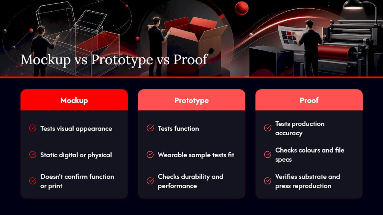
A mockup deals purely with visual appearance. It’s a static representation, digital or physical, that shows what something looks like without confirming it functions or prints correctly. A prototype goes further: prototypes validate whether something works as intended, not just whether it looks right. In apparel and product design, that might mean a wearable sample tested for stretch, durability, and fit rather than just how the print looks in a photo. In footwear, that same principle shows up in physical sneaker prototype development, where a constructed sample gets tested for how it performs, not just how it photographs.
A proof, by contrast, is entirely about production accuracy. It doesn’t ask whether the design looks appealing or functions well. It asks whether the specific file, in the specific colors and specifications given, will reproduce faithfully on the specific substrate and press being used.
Here’s a simple way to keep them separate: a mockup tests the idea, a prototype tests the function, and a proof tests the production. Skipping any one of the three for a job that actually needs it is how avoidable problems slip through. A shirt design might look great as a mockup, survive prototype testing for fit, and still come back with the wrong shade of red because nobody pulled a hard proof before the run.
Tools Designers and Printers Actually Use for Mockups and Proofs
Mockup creation mostly happens in familiar design software. Adobe Photoshop and Illustrator remain the standard for smart object mockups, where you drop flattened artwork into a pre-built template that shows folds, shadows, and fabric texture. For quicker turnaround, browser-based mockup generators let you upload a logo and instantly preview it on dozens of garment styles without touching layered files.
Proofing tools work differently because accuracy, not speed, is the priority. Soft proofing relies on color-managed software paired with a calibrated monitor and ICC color profiles, since color management systems increase soft-proof accuracy and an uncalibrated screen makes any color judgment unreliable. Adobe Acrobat’s soft-proofing feature, which simulates output profiles on screen, is common in prepress workflows for exactly this reason.
For physical proofing, print shops use dedicated proofing presses or calibrated inkjet proofers that closely match the color gamut of the final production press. Packaging and promotional goods often add another layer: physical sample production for three-dimensional items, similar to how suppliers of custom gadgets and promotional items build constructed samples to confirm how a design wraps around dimensional products before committing to a full run.
For apparel specifically, live design preview tools that show your artwork directly on a garment template before you check out give you a fast, practical middle ground between a rough digital mockup and a full physical sample.
Industry Standards and Best Practices for Proofing
There’s no single universal proofing standard across every print category, but a few practices show up consistently across professional shops. The first is matching proof type to project risk rather than defaulting to the cheapest option every time. A soft proof is fine for a one-off personal order; it’s not fine for a corporate rebrand going on 500 uniforms.
The second is documentation discipline. A signed contract proof typically authorizes the press run exactly as shown, which means the sign-off itself needs a clear record: who approved it, on what date, and which version of the file. Without that metadata, disputes after the fact become nearly impossible to resolve cleanly.
The third standard practice, and one that trips up more first-time print buyers than anything else, is understanding that RGB and CMYK are not interchangeable color spaces. A design that looks vibrant on a monitor set to RGB can shift noticeably once converted to CMYK for print. Our own breakdown on avoiding costly reprints between RGB and CMYK covers this in more depth, but the short version is: always proof in the color space your job will actually print in, not the one your screen defaults to.
Finally, best practice treats proofing as a checkpoint, not a formality. A proof that gets rubber-stamped without anyone actually comparing it to brand specs defeats the entire purpose of requesting one.
Reading Feedback and Revisions on Proofs and Mockups
Feedback on a mockup and feedback on a proof should be treated as fundamentally different conversations, even though clients often blur them together.
Mockup feedback is usually about direction: wrong placement, size adjustments, color mood, or a request to try an entirely different layout. This is the cheap, low-stakes stage to iterate quickly, and it’s exactly why keeping early mockups rough pays off. Revisions here are fast and inexpensive because nothing has gone to a printer yet.
Proof feedback should be narrower and more technical. If someone is requesting layout changes, new color choices, or a different design concept at the proof stage, that’s a signal the mockup stage didn’t do its job, and it’s worth flagging that the request will likely add cost and delay. Legitimate proof feedback looks like: “this Pantone doesn’t match our swatch,” or “the trim line is cutting off the logo,” or “there’s a typo in the address line.” Those are production accuracy issues, exactly what a proof exists to catch.
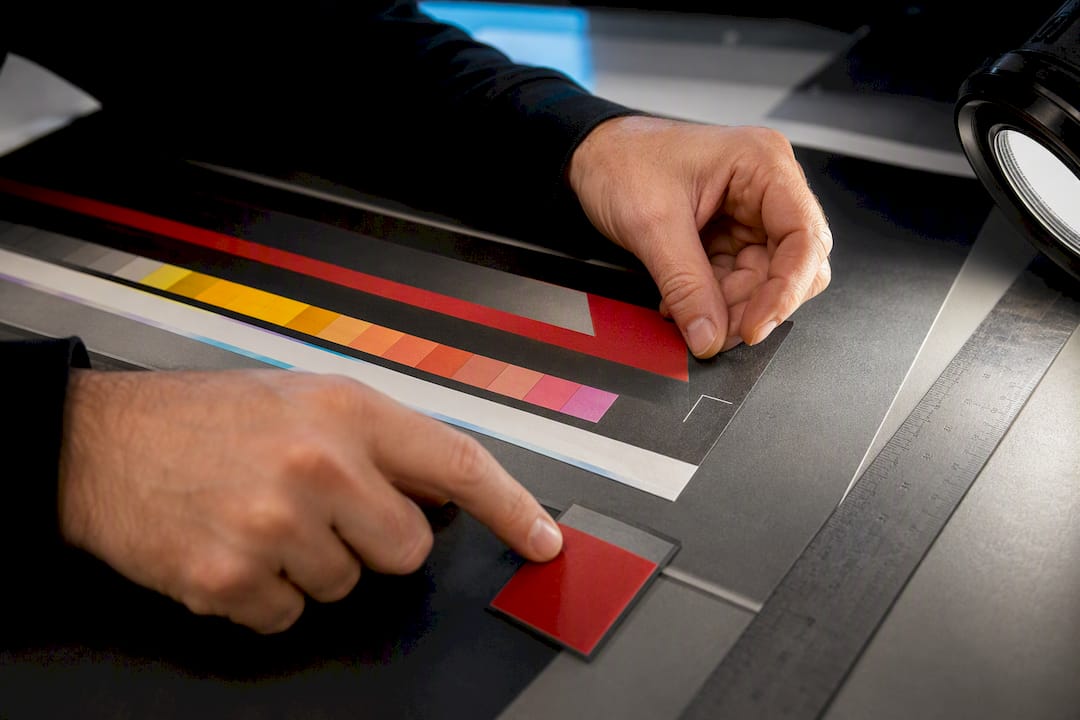
When you get proof feedback back from a client, resist making changes directly on the proof file without documenting what changed and why. Track each revision with a version number, and reissue a new proof for any change that touches color, text, or layout, even a small one. Skipping a re-proof after a “minor” text edit is a common way small errors slip through to the final run. If the request is substantial enough to require a new proof, treat it as its own approval cycle rather than a quick patch on the old one.
Where to Go From Here
For the deeper technical background behind proofing standards, Wikipedia’s overview of prepress proofing and GlobalVision’s breakdown of printer’s proofs are solid starting points. If you’re weighing production methods before you get to the proofing stage, our comparison of DTF versus screen printing covers how substrate choice affects what a proof needs to catch.
The Real Gap in How People Think About Proofing
Most guides on this topic treat proofing as a compliance checkbox, something you rush through because a printer requires it before running your job. That framing misses the point entirely. Proofing isn’t a gate you have to clear. It’s the cheapest form of quality control you’ll ever get access to in the entire production process, and treating it as an afterthought is where most preventable reprints actually come from.
The conventional advice also overstates how much a polished mockup matters early on. Clients love seeing a beautiful render, but a mockup that looks finished before the design direction is settled tends to shut down useful feedback rather than invite it. The better move, one that goes against the instinct to impress early, is showing rougher work sooner and saving the polish for after direction is locked.
If there’s one thing worth prioritizing above everything else in this guide, it’s this: match your proofing rigor to the actual risk of the job, not to how much time you feel like spending. A single shirt for a birthday gift doesn’t need a contract proof. A 300-unit branded uniform order absolutely does. Skipping that judgment call, in either direction, is where time and money get wasted.
— Toronto
Sources
- Mockup vs prototype — Miro
- Prepress proofing — Wikipedia
- What is a Printer’s Proof? The Complete Definition. — GlobalVision
- What is a Print Proof? Guide for Professional Printers — Cevagraf
Recommended
Get pricing in 24h.
Toronto-based, no minimums. Tell us about your project and we'll email a detailed quote within one business day.
Request a Quote