5 Fail Safe T Shirt Color Combos for Screen, DTG and DTF
Five print tested t shirt color combos proven to reproduce across screen printing, DTG and DTF. Includes a proof checklist, underbase notes, and sample tips.
5 Fail Safe T Shirt Color Combos for Screen, DTG and DTF
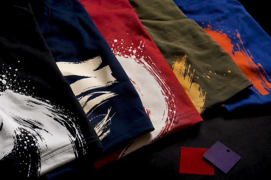
White ink on black, black ink on white, white on navy, and black on heather gray survive every printing method and every lighting condition. Fabric and print method still shift the final result, and both get covered below.
TL;DR:
- Dark fabric generally requires a white underbase for bright ink colors; skipping this step leads to muted, less vibrant results.
- Screen printing produces clean, bold colors but becomes more expensive with additional ink colors, while DTG offers full-color gradients at no extra cost per color.
- Using a printed sample before bulk orders helps verify how colors and contrast will look in real life, preventing costly mistakes.
- Neutrals like white and black dominate because they easily pair with other colors and keep designs legible across different outfits.
- Subtle, tonal color schemes work well for premium or minimalist styles but require testing under actual lighting to ensure visibility.
Table of Contents
- Color Theory Basics Every T-Shirt Designer Should Know
- Proven Shirt and Ink Combinations Worth Copying
- How Screen Printing, DTG, and DTF Change Your Color Options
- A Quick Checklist Before You Approve Any T-Shirt Color Combination
- Common Color and Printing Mistakes (and How to Fix Them)
- What Printing a Sample Actually Looks Like
- The Psychology Behind Popular T-Shirt Colors
- Matching Your T-Shirt Palette to the Season and the Occasion
- Matching Your T-Shirt Color to the Rest of Your Outfit
- Using Neutrals and Accent Colors the Right Way
- When Breaking the Rules Works
- Get a Printed Sample Before You Commit to a Full Run
- Sources
Color Theory Basics Every T-Shirt Designer Should Know
Before picking t-shirt color combinations, you need three terms and one test. Complementary colors sit across from each other on the color wheel (orange and blue, red and green) and create high-energy contrast. Analogous colors sit next to each other (blue, teal, green) and read as calm and cohesive. Triadic schemes pull three colors evenly spaced around the wheel, giving you variety without clashing. Analogous schemes read as harmonious while complementary pairs create high-energy contrast, so the choice depends on whether you want a design to shout or blend in.
Contrast (technically “value,” meaning how light or dark a color is) matters more than which hues you chose. Two colors can be totally different but still read as mushy if their values are close. A quick check: convert a photo of your mockup to grayscale and see if the design still pops. If it disappears in black and white, it will disappear from ten feet away too.
Fabric changes how ink looks once it’s actually printed:
- Heathered fabrics blend flecks of gray or other fibers into the base color, which slightly desaturates ink on top of it.
- Tri-blend shirts (cotton, polyester, rayon) have a looser weave that softens fine detail and gives colors a faded, vintage cast.
- Polyester and performance fabrics can cause dye migration on darker colors, which is why some printers add a low-bleed underbase before printing on athletic wear.
Pro Tip: Snap a photo of your digital mockup on your phone, shrink it to thumbnail size, and see if the design is still legible. If you can’t tell what it says at that size, your customer won’t be able to either from across a room.
Proven Shirt and Ink Combinations Worth Copying
Here’s a working list of t-shirt color schemes that hold up in production, not just on a screen. Each one is grouped by intent, so you can match the mood you’re after with a combination that’s actually been tested at scale.
Safe starter picks (start here if you’re not sure):
- White ink on black cotton
- Black ink on white cotton
- White ink on navy
- Black ink on heather gray
- Cream ink on forest green
High-contrast classics
- Black shirt, white ink. The most legible combination in printing, full stop. White-on-black and black-on-white are the two most widely used, most legible pairings in the industry, which is why nearly every band shirt, gym tee, and warning label defaults to one or the other. Works for any print method; no underbase needed on the white shirt version.
- White shirt, black ink. The inverse of the above, and just as dependable. Best for text-heavy designs, logos, and anything that needs to photograph well for e-commerce listings.
- Navy shirt, white ink. Slightly softer than true black but still hits well above the 40% contrast threshold. A go-to for corporate and team orders because navy reads as more “professional” than black in most audits.
- Heather gray shirt, black ink. The heather texture adds visual depth without hurting legibility, since gray and black still sit far apart in value.
Brand-forward complementary pairs
- Royal blue shirt, orange ink. A textbook complementary pairing that reads as energetic and sport-branded. Common for athletic teams and youth apparel; needs a bright, opaque ink to avoid looking washed out on darker blue.
- Red shirt, green ink. High energy, best used sparingly (small logo or chest hit rather than an all-over print), since large blocks of true complementary color can vibrate visually and tire the eye.
- Purple shirt, yellow ink. Underused but effective for music and festival merchandise where you want the design to jump off a rack of black and gray shirts.
Tonal and muted combos
- Sage green shirt, cream ink. Low contrast by design, meant for a soft, boutique aesthetic rather than shelf visibility. Works best on ring-spun cotton, where the fabric itself already has a matte, premium feel.
- Dusty rose shirt, white ink. A popular choice for small-batch apparel brands that want something that photographs well on social media rather than something that reads at a distance.
- Charcoal shirt, light gray ink. Subtle, editorial, and best reserved for simple wordmarks rather than detailed artwork, since the low contrast will swallow fine lines.
Vintage and earth-tone palettes
- Clay shirt, cream ink. Earthy palettes like clay paired with cream, and chocolate paired with matcha, are among the trend-forward combinations showing up in current apparel roundups. Reads as warm and lived-in without sacrificing legibility.
- Olive shirt, gold ink. A military-adjacent, vintage-military aesthetic that has held steady in streetwear for several seasons. Gold ink needs a strong underbase on darker olive fabric to avoid looking dull.
- Chocolate shirt, matcha green ink. One of the standout earth-tone pairings, unusual enough to look intentional rather than accidental, and well suited to small logo placements.
Trend-forward modern combos
- Terracotta shirt, off-white ink. Warm, current, and flattering across most skin tones, which is part of why it’s turned up so often in recent apparel drops.
- Butter yellow shirt, white ink. A softer alternative to bright yellow that keeps enough contrast for legibility while feeling less “safety vest” than a saturated yellow base.
How Screen Printing, DTG, and DTF Change Your Color Options
Dark garments almost always need a white underbase layer before colored ink goes on top. Without an underbase, bright inks printed directly on black or navy fabric look muted and can pick up the shirt’s own color underneath. That extra layer adds a small cost and a slightly stiffer feel to the print, but it’s the difference between a design that pops and one that looks washed out three washes in.
Screen printing and digital methods handle color differently:
- Screen printing applies solid, opaque layers of ink one color at a time, which is why it reproduces flat colors and bold designs so cleanly, but adds cost per additional color.
- DTG (direct-to-garment) prints like an inkjet onto the fabric, giving you full-color gradients and photo-realistic art at no extra per-color cost, though colors can look slightly less saturated on dark shirts without a strong underbase.
- DTF (direct-to-film) transfers a printed film onto the shirt with heat, and handles metallics, gradients, and fine detail well across almost any fabric, cotton or polyester.
- Polyester and performance blends need low-bleed or specialty inks to prevent dye migration, especially with bright colors on dark athletic fabric.
A Quick Checklist Before You Approve Any T-Shirt Color Combination
Run any pairing through these steps before you send art to print:
- Know your viewing distance. A shirt read at arm’s length (event merch, retail) can carry more detail than one meant to be seen across a room (team jerseys, race bibs).
- Check brand hierarchy. If this shirt represents a business or event, the color pairing should echo the existing brand palette, since color shapes brand perception before a viewer even processes the logo or text.
- Run the grayscale test. Convert your mockup to black and white; if the design vanishes, the color contrast is too low.
- Confirm the print method and underbase needs with your printer before finalizing art, since this affects both cost and final vibrancy.
- Request a printed sample, not just a digital proof, before committing to a bulk order.
When you’re talking to a printer, ask directly: can they Pantone match or proof colors in-house, will they use an underbase on dark garments, and what’s the turnaround difference between a single sample and a full production run? If a printer skips the sample step entirely, or can’t tell you whether your fabric needs an underbase, treat that as a warning sign.
Pro Tip: Ask to see a printed sample under both daylight and indoor lighting before approving a bulk order. Ink that looks perfect under a store’s warm lighting can shift noticeably under office fluorescents.
Common Color and Printing Mistakes (and How to Fix Them)
The same handful of mistakes show up again and again in custom apparel orders:
- Thin lines and fine text on textured fabric. Heathered and tri-blend shirts soften detail, so a design that looks crisp on a smooth cotton mockup can blur on textured fabric.
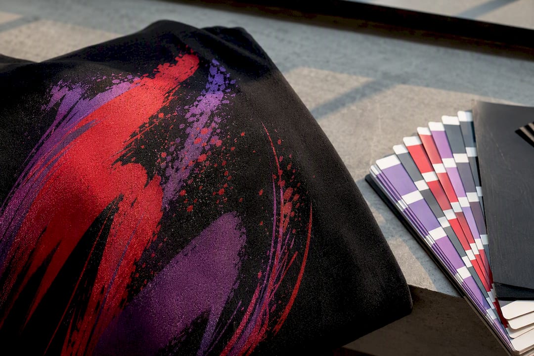
- Trusting an on-screen color preview. Monitors render color differently than printed ink does, especially on dark or heathered garments.
- Overloading a design with too many ink colors on a screen-printed order, which drives up per-shirt cost fast.
Quick fixes: add a thin white or black outline around text to preserve readability on busy fabric, increase the value gap between shirt and ink if a grayscale test looks flat, and consider a simulated process print (which blends fewer screens to fake a wider color range) if your budget can’t support a six-color design.
What Printing a Sample Actually Looks Like
A single printed sample through small-run DTF or DTG lets you test a color combination affordably before committing to a full screen-printed order, and it usually turns around faster than a bulk run since there’s no screen setup involved. Bulk screen printing needs more lead time up front for screens and proofing, but it brings the per-shirt cost down once you’re past a few dozen units.
To move from idea to sample fast, have ready: vector artwork (not a low-res JPEG), clear Pantone numbers or an RGB reference for your printer to proof against, and the exact garment style and color you’re printing on. Local pickup and rush options can shorten the gap between ordering a sample and seeing it in hand, which matters most when you’re testing a trend-forward combo you’re not fully sold on yet.
The Psychology Behind Popular T-Shirt Colors
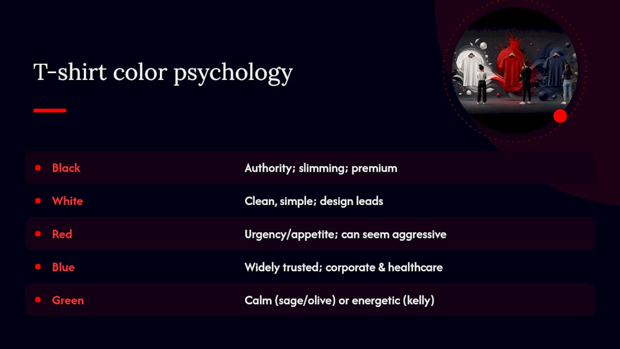
Black reads as authoritative and slimming, which is exactly why it dominates band merchandise, streetwear, and anything trying to look premium without trying too hard. White signals cleanliness and simplicity, and it’s the default for brands that want the design itself, not the shirt, to carry the message.
Red triggers urgency and appetite, which is part of why it shows up so often in food and sports branding, but large fields of red ink can also read as aggressive if that’s not the intent. Blue is the most broadly trusted color across demographics, which explains its dominance in corporate and healthcare apparel. Green pulls double duty: sage and olive read as calm and natural, while a saturated kelly green reads as energetic and sport-branded.
Yellow grabs attention faster than almost any other color but tires the eye in large doses, so it works best as an accent rather than a full shirt base. Purple carries a slightly luxurious, creative connotation and tends to perform well for music, art, and wellness brands looking to stand apart from a sea of black and navy competitors. None of this means you need a psychology degree to pick a shirt color, but it does explain why certain t-shirt color schemes keep reappearing across entire industries instead of fading out as fads.
Matching Your T-Shirt Palette to the Season and the Occasion
Warm weather calls for lighter shirt bases (white, sand, pale blue) paired with saturated ink, since dark fabric absorbs heat and light colors photograph better outdoors. Fall and winter releases lean into deeper tones: maroon, forest green, charcoal, and navy all pair well with cream or gold ink for a seasonal feel that still holds strong contrast.
Occasion matters as much as season. A corporate event or team order usually calls for restrained, brand-aligned pairings like navy with white or gray with black, both of which photograph cleanly and won’t clash with whatever else attendees are wearing. Bachelor and bachelorette party shirts tend to go the opposite direction on purpose, leaning into bright complementary pairs (hot pink and lime, orange and turquoise) specifically because they’re meant to stand out in photos for one day only.
Holiday-specific runs (Halloween, winter events) often use a limited, symbolic palette: black and orange, red and green, that trades subtlety for instant recognition. Race and fun-run shirts frequently use safety yellow or bright orange with black ink for the same reason high-visibility gear does: distance legibility outranks style. If you’re ordering for an outdoor event, keep in mind that direct sunlight washes out light or pastel prints faster than it does dark, saturated ones, so factor lighting conditions into the palette the same way you’d factor in the season.
Matching Your T-Shirt Color to the Rest of Your Outfit
A printed t-shirt doesn’t exist in isolation. The color combination you choose for the shirt itself should also work with whatever pants, jackets, or layers people are likely to wear it with, especially for team apparel or events where the shirt is one piece of a bigger look.
Neutral-based shirts (white, black, gray, navy) pair easily with almost anything, which is a big part of why those four colors dominate proven t-shirt color combinations in the first place. A black shirt with white ink works over dark jeans, khakis, or under a jacket without a single clash. Earth-tone shirts (olive, clay, terracotta) pair naturally with denim and other neutral bottoms, which is part of why that palette has held up so well in casual and streetwear apparel.
Bright, saturated shirts need more thought. A shirt with a bold complementary print (royal blue and orange, for example) tends to look best against simple, dark bottoms, since busy pants or patterned layers compete with an already-loud design. If you’re designing apparel for an event where attendees will layer the shirt under a jacket or hoodie, keep the design placement higher on the chest so it stays visible when partially zipped or buttoned.
Using Neutrals and Accent Colors the Right Way
Neutrals (white, black, gray, navy, cream) do the heavy lifting in almost every durable t-shirt color scheme, because they provide the contrast base that makes an accent color pop. A shirt built entirely from saturated hues, with no neutral anywhere in the design, tends to look busy and can undercut the exact legibility you’re trying to achieve.
That’s the same logic behind why olive shirts with a single gold accent, or charcoal shirts with one bright highlight color, keep showing up across trend lists. Two or three accent colors can work, but each additional non-neutral hue you add increases both printing cost on screen-printed jobs and the risk of the design reading as cluttered rather than intentional.
When Breaking the Rules Works
Tonal, low-contrast pairings, cream on clay, charcoal on black, have a real place in premium and minimalist apparel, where the goal is texture and subtlety over shelf visibility. Warn clients up front that a subtle look may not read past a few feet, and always push for a printed sample before approving artwork this close in value. Lighting and fabric texture do a lot of the work here, so test under real conditions, not just a screen mockup.
— Toronto
Get a Printed Sample Before You Commit to a Full Run
You can turn color decisions into something you can actually hold, not just imagine on a screen. Instead of guessing whether that clay-on-cream combo or navy-and-white classic will print the way it looks in your mockup, you can order a single printed sample through small-run DTF or DTG and see the real result before committing to a bulk screen-printed order.
Some custom apparel services include design support to catch contrast and underbase issues before printing, offer rush turnaround options, and local pickup in select areas. Whether you need one customizable t-shirt to test a new palette or a full bulk order for your team or event, we help you catch the mistakes covered above, weak contrast, missing underbase, mismatched fabric, before they turn into a box of shirts you can’t use. Start by requesting a color proof or ordering a single sample at Torontocustomtshirts.
Sources
- T-shirt and ink color combinations — Printify
- 29 T-shirt color combinations to make your custom apparel pop — VistaPrint
- 12 T-Shirt Color Combinations that Will Work Every Time — Bonfire
- T-shirt and ink color combinations — Printful
Recommended
Get pricing in 24h.
Toronto-based, no minimums. Tell us about your project and we'll email a detailed quote within one business day.
Request a Quote