Toronto Hat Logo Placement: Proof Checklist to Avoid Rework
Practical Toronto hat logo placement guide with 4 to 5 in front-center sizes, a shop-tested proof checklist, and ordering steps to get proofs right and...
Toronto Hat Logo Placement: Proof Checklist to Avoid Rework
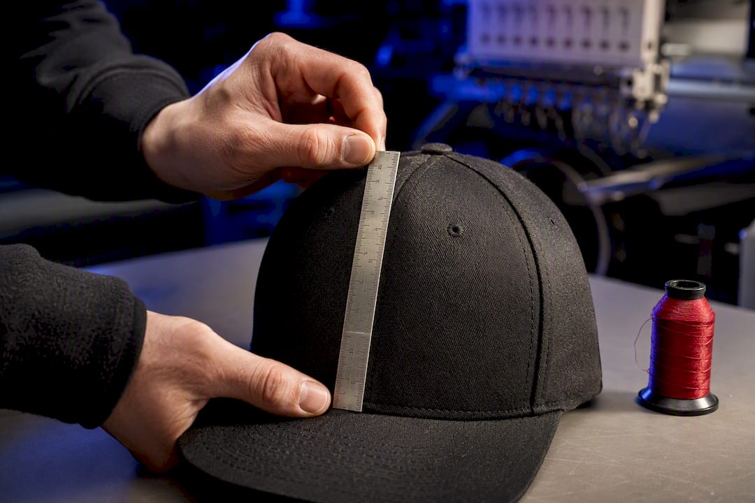
Front-center is the strongest placement for almost every hat style, and the sizing rule that governs everything else is simple: match the logo’s height to the crown’s height, then stay inside the safe zone. A mid-profile cap can carry a taller mark than a low-profile dad hat. Every other decision, from beanies to bucket hats, follows from that one measurement.
TL;DR:
- Logo size varies significantly with crown height, requiring careful reassessment when transferring designs from mid-profile to low-profile caps.
- Beanies prioritize cuff placement for embroidery due to stability, with crown placements risking distortion from fabric stretch.
- Mesh and bucket hats demand simplified designs or patches, as complex embroidery can cause puckering and shape distortion.
- Proper proofing includes scaled mockups with precise measurements and physical samples to prevent costly rework and ensure correct placement.
- Front-center placement offers maximum visibility and brand impact, but industry and hat shape influence size choices and secondary positions.
Table of Contents
- Quick reference: hat logo placement sizes and safe zones by style
- How crown height changes logo size on baseball caps and dad hats
- Placing a logo on a beanie: cuff versus crown
- Trucker, bucket hat, and visor logo placement: what actually works
- Preparing artwork: digitization rules that shape final size and clarity
- What to request when ordering: a proof checklist that prevents rework
- Common hat logo mistakes and how to avoid them
- Considerations for different hat materials and how they affect logo placement
- How logo placement affects brand visibility and marketing impact
- Comparing logo placement preferences across industries
- How Toronto Custom T-Shirts applies these rules in production
- Toronto Custom T-Shirts: custom hat services and what to request when you order
- Sources
Quick reference: hat logo placement sizes and safe zones by style
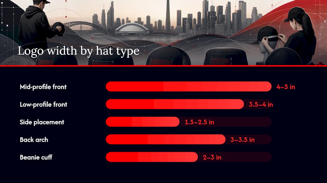
Before sending anything to a digitizer, it helps to know the numbers you’re working with. Crown profile drives almost every sizing decision, and the ranges below come from standard embroidery practice across structured caps, low-profile styles, and knit beanies.
| Hat Type / Placement | Width Range | Height Range | Notes |
|---|---|---|---|
| Mid-profile structured cap, front-center | 4–5 in | 2–2.5 in | Most common placement; supports full wordmarks |
| Low-profile / dad hat, front-center | 3.5–4 in | Under 2 in | Shorter crown limits vertical stroke height |
| Side placement | 1.5–2.5 in | 1 inch | Best for small icons or single initials |
| Back arch | 3–3.5 in | Up to 1 in | Follows the curve above the adjustable strap |
| Beanie cuff | 2–3 in | Varies with cuff depth | Most stable and visible beanie placement |
| Beanie crown | 1.5–2.5 in | Simplified art only | Stretch limits fine detail |
The front-center range of roughly 4 to 5 inches wide by 2 to 2.5 inches tall applies to structured six-panel caps with a mid or high crown. Drop to a low-profile silhouette, and the safe zone shrinks to about 3.5 to 4 inches wide and under 2 inches tall, because there’s simply less vertical real estate between the visor seam and the top of the panel.
Side and back placements work on a different logic. They’re rarely the star of the design. A side placement in the 1.5 to 2.5 inch width range fits a small icon, a single letter, or a short abbreviation, not a full logo lockup. Back placements follow the curve of the panel above the strap or snapback closure, typically 3 to 3.5 inches wide and no more than an inch tall, which is why brands often use them for a URL, a tagline, or a repeated brand mark rather than the primary logo.
Beanies run on cuff depth instead of crown height. A folded cuff on a standard beanie gives you roughly 2 to 3 inches of usable width, and that number moves depending on how deep the cuff is folded. Push into crown territory on a beanie and the rules change entirely, since knit fabric stretches in ways woven cotton twill never does.
Pro Tip: Keep a printed copy of this table next to you when you’re briefing a designer or filling out an order form. Giving a supplier “make it big” instructions leads to rework. Giving them “4 inches wide, 2.25 inches tall, front-center” gets you a usable proof on the first try.
How crown height changes logo size on baseball caps and dad hats
Crown height is the single biggest variable in cap logo sizing, and it’s the first measurement to take before anyone touches a digitizing program. A structured six-panel cap with a mid or high crown gives you roughly 2 to 2.5 inches of vertical space to work with at front-center. A low-profile or dad hat crown, by contrast, often caps out under 2 inches before the design starts crowding the top seam or dipping too close to the visor.
That difference matters more than most people expect. A logo digitized at 2.25 inches tall for a mid-profile cap will often look cramped or run into the top panel seam when it’s applied to a low-profile model at the same height. The fix isn’t to shrink everything uniformly. It’s to reassess the layout for the specific crown you’re using.
A few placement habits keep cap logos looking clean across crown types:
- Keep the bottom edge of the design at least a quarter inch above the visor stitch line so it doesn’t crowd the brim.
- Avoid running fine strokes or thin serifs directly across the center seam, where the fabric panels meet and stitching can pucker.
- Check eyelet spacing on the sides before placing a secondary mark there. Eyelets can sit right where a small logo wants to go.
- For tall wordmarks that won’t fit within a low-profile crown’s height allowance, shift to a front-offset placement instead of shrinking the type until it’s unreadable.
Front offset is worth considering more often than it gets used. A logo that reads clearly at 2 inches tall front-center might need to shrink to 1.5 inches to fit a dad hat’s crown, and at that size, thin letterforms start to lose legibility. Moving the same design slightly off-center, angled toward the side panel, sometimes preserves the original scale without hitting the seam or the visor line. This works particularly well for logos with a strong horizontal wordmark component, where an offset placement reads almost like a badge rather than a squeezed-in centerpiece.
Placing a logo on a beanie: cuff versus crown
The cuff wins for nearly every beanie order, and there’s a structural reason why. A folded cuff is doubled fabric, which gives the embroidery machine a more stable, less stretchy surface to stitch into. Single-layer crown fabric moves under the needle, and that movement is what causes puckering, distortion, and thread breaks on complex designs.
Cuff placement also happens to be the most visible spot on the entire hat. It sits at eye level, front and center, exactly where anyone glancing at the wearer will look first. That combination of stability and visibility is why the cuff has become the default for embroidered beanie logos rather than an afterthought.
Crown placement isn’t off the table, but it comes with real constraints:
- Single-layer knit stretches in multiple directions, so tight lettering or thin outlines can distort once the beanie is worn and the fabric pulls taut.
- Complex multi-color logos with fine detail tend to digitize poorly on crown knit; simplified, bolder versions of the same mark hold up far better.
- Stitch density needs to be tighter on crown placements to compensate for the fabric’s give, which can make the finished logo feel heavier or stiffer than the same design on a cuff.
For letter height, keep cuff text in the 0.5 to 0.75 inch range for single lines and scale a combination mark up to the 2 to 3 inch width guidance from the reference table above. When a design has genuinely fine detail, small taglines, gradient shading, or thin script, a woven patch sewn onto the cuff is often a better call than trying to force it through a knit embroidery machine. Patches hold sharp edges that direct embroidery on stretchy fabric simply can’t match.
Trucker, bucket hat, and visor logo placement: what actually works
Mesh, brim, and low-profile silhouettes each come with their own physical limits, and ignoring them is where most first-time hat orders run into trouble.
Trucker caps have mesh back panels, and mesh is genuinely difficult to embroider well. Dense fills on open-weave mesh tend to pucker, gap, or show the backing material through the stitches. The safer route for mesh panels is simplified line art with fewer fill areas, or skipping direct embroidery altogether in favor of a small sewn-on patch. A woven or embroidered patch applied over mesh holds detail that direct stitching can’t, because the patch itself is digitized on stable fabric before it ever touches the cap.
Bucket hats have the opposite problem: not too little stability, but too little vertical space. The panel structure curves aggressively, and there’s rarely more than an inch and a half of usable height before the design starts wrapping around the curve. Compact, centered marks, a single icon or short initials, work better than anything with a wide horizontal spread. Wordmarks that read fine on a flat cap panel often look stretched or cut off on a bucket hat’s rounder shape.
Visors present a different challenge again. There’s no crown to work with, just a brim and a narrow band. Large or detailed artwork on that band often needs printed fabric or a heat-applied patch rather than direct stitching, since visible needle holes on the thin brim material can look messy at close range once the thread wears in. A few practical guidelines cover most cases:
- Keep trucker mesh embroidery simple, or switch to patches for anything with more than two or three colors.
- Center bucket hat logos and keep total width under about 2 inches to avoid wraparound distortion.
- Use patches or printed transfers on visors for logos wider than a couple of inches.
Preparing artwork: digitization rules that shape final size and clarity
A logo that looks perfect on screen doesn’t automatically translate to a clean embroidered result, and the gap between the two is almost always about scale and detail, not design quality. Digitizers convert a logo into a stitch file, and that process has hard technical limits that no amount of good design intent can override.
Minimum stroke width is the first constraint. Thin lines under roughly 0.08 inches tend to under-sew or disappear entirely once the machine runs the stitch file, because the needle simply can’t lay thread cleanly at that scale. The usual fix is converting fine details, thin serifs, small counters, hairline dividers, into solid shapes or removing them and letting the bolder elements carry the design. Digitizers frequently ask for exactly this kind of simplification before they’ll commit to a final stitch count.
3D puff embroidery has its own rule set on top of the standard limits. Puff foam needs room to sit flat, so placements that cross a raised seam or the cap’s center ridge tend to distort the foam and produce an uneven finish. Thin strokes don’t work in puff at all; the foam needs enough width to hold its shape. A common workaround combines puff for the primary letters or icon with flat satin stitching for smaller supporting details, giving a design visual depth without asking the puff technique to do something it physically can’t.
A few production habits make the difference between a first-pass approval and a round of costly revisions:
- Convert fine outlines and small text to solid, bold shapes before submitting artwork for digitizing.
- Choose thread colors with strong contrast against the hat fabric; low-contrast combinations are the most common reason small logos read as a blur rather than clean text.
- Ask about underlay and stitch direction for large fill areas, since these affect how flat and smooth the final embroidery lies.
- Consider a patch or DTF transfer instead of direct embroidery when a logo has more detail than the stitch limits can realistically support.
Pro Tip: If a designer tells you a logo needs simplifying for embroidery, don’t treat it as a downgrade. A cleaner, bolder version of a mark almost always reads better at hat scale than the full detailed version crammed into two inches. Brand-identity specialists like Cursor Cat Digital can help build a simplified secondary mark specifically for small-format use if your primary logo has too much fine detail to embroider well.
What to request when ordering: a proof checklist that prevents rework
A good proof does one job: it removes guesswork before production starts. Send this list to any supplier, and you’ll cut down on back-and-forth revisions considerably.
- Ask for scaled mockups from three angles. Front, side, and back views, each showing actual inch or millimeter dimensions overlaid on the artwork, not just a visual approximation.
- Confirm placement relative to fixed landmarks. The visor stitch line, the center panel seam, and any eyelets should be marked on the proof so you can see exactly how close the design sits to each one.
- Request a stitch-count note for complex fills. Dense areas take longer to sew and can affect both cost and how the fabric behaves once the machine gets running.
- Ask about thread color matching. Confirm the supplier is matching to a standard thread chart rather than eyeballing a close shade.
- Get a physical sample for anything new. New hat model, new technique, or first order with a given supplier, a single stitched sample before a full run catches problems a digital mockup can miss entirely.
That last step matters more than it sounds. A flat digital rendering can’t always show how puff foam will sit near a seam, or how a mesh panel will actually take a fill stitch. One physical sample, even a small one, resolves ambiguity that no amount of back-and-forth on a screen mockup will.
Common hat logo mistakes and how to avoid them
Most rework requests trace back to a handful of repeat offenders. Watch for these:
- Tiny text that won’t survive digitizing. Anything under about a quarter inch tall on embroidery starts to blur together, especially in script fonts.
- Puff elements placed across seams. The foam can’t sit flat over a raised ridge, and the result looks lumpy rather than crisp.
- Overly detailed art on mesh or knit. Both fabrics move under the needle; complex fills that work fine on structured cotton twill often fail here.
- Skipping a one-color test proof. A single-color stitch-out reveals scale and clarity problems before you’ve committed to a full multi-thread run.
- Inconsistent scaling across a product line. A logo that’s 4 inches wide on a snapback and 2.5 inches on a dad hat should look proportionally similar, not like two different designs.
Pro Tip: When ordering multiple hat styles with the same logo, ask your supplier to confirm relative proportions across the lineup, not just absolute dimensions. A logo that “looks right” on each hat individually can still look inconsistent when the whole product line sits on a shelf together.
Considerations for different hat materials and how they affect logo placement
Fabric choice changes what’s possible before size or placement ever enters the conversation. Structured cotton twill, the material most baseball caps are built from, holds embroidery stitches cleanly and supports the widest range of placements and techniques, including 3D puff.
Polyester performance caps behave differently. The tighter weave resists stretch, which is good for stitch stability, but the smoother surface can make thread show less contrast than it would on cotton twill, so color selection matters more.
Knit beanie fabric is the most demanding material on this list. It stretches in multiple directions, which is exactly why cuff placement, with its doubled, more stable layer, outperforms crown placement for anything beyond a simple mark.
Mesh, as covered earlier, has the least tolerance for dense embroidery and generally does better with patches or simplified line work. Canvas and heavier duck-cloth hats, often used for bucket styles, sit somewhere in the middle: sturdy enough for solid fills, but the curved panel shape still limits how much vertical space a design can use. Matching the technique to the fabric, rather than forcing one approach across every material, is what separates a clean finished hat from one that needed a second attempt.
How logo placement affects brand visibility and marketing impact
Front-center placement isn’t the default because it’s easy. It’s the default because it’s the first thing anyone sees when they look at a person wearing a hat, whether that’s across a table, on a job site, or in a photo posted online. A logo tucked on the side or back only gets noticed by someone specifically looking for it.
That visibility difference has real marketing weight for promotional and team hats. A hat handed out at an event, worn on a delivery route, or issued as staff uniform apparel spends most of its life being seen from the front, at a distance, often in passing. A cramped or overly detailed front-center mark loses to a simpler, bolder one every time in that kind of glance-length exposure.
Side and back placements aren’t wasted space, though. They work well for a secondary detail: a website, a founding year, a tagline, something a customer might notice on closer inspection after the front logo has already registered. Under-brim placement takes this even further, rewarding the wearer rather than a passerby, which some brands use deliberately to build a sense of insider detail into a hat that otherwise looks simple from the outside.
Comparing logo placement preferences across industries
Different industries lean on different placements, and the pattern usually tracks how the hat gets worn and who’s meant to notice it.
Sports and streetwear brands favor bold front-center marks sized toward the larger end of the safe-zone range, since brand recognition at a glance is the entire point. Corporate and trade uniform programs often go smaller and more restrained up front, pairing a compact front-center logo with a side placement carrying a name or department, prioritizing a clean look over maximum visibility.
Outdoor and utility brands frequently use back placements for taglines or slogans, keeping the front mark minimal, almost a signature rather than a statement. Event and promotional hats, on the other hand, tend to maximize front-center size within the safe zone, since the hat itself is often the only branded touchpoint a person walks away with. There’s no universal right answer here. The choice comes down to whether the hat needs to announce a brand loudly or represent it quietly, and that decision should shape the size and placement brief before a single stitch gets planned.
How Toronto Custom T-Shirts applies these rules in production
Every hat order starts with a measurement, not a guess. Before anything gets digitized, the crown height and cuff depth of the specific hat model get checked, and safe zones get marked out based on that actual profile rather than a generic template. A mid-profile snapback and a low-profile dad hat get treated as two different sizing problems, because they are.
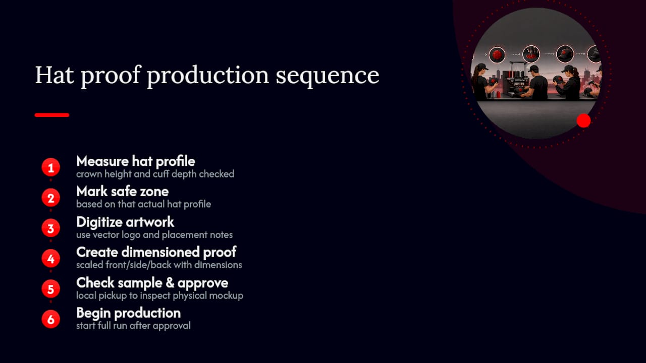
Proofs typically turn around within a few business days, showing scaled front, side, and back views with dimensions marked against the visor line and center seam. Local pickup is available across the GTA, which makes it straightforward to check a physical sample in person before committing to a full run, particularly useful for a first order on a new hat style.
To speed things along, send the hat model, vector artwork, the placement you’re aiming for, and a note requesting a dimensioned proof. That’s usually enough to get a first mockup back without needing a round of clarifying questions first.
— Toronto
Toronto Custom T-Shirts: custom hat services and what to request when you order
Toronto Custom T-Shirts handles embroidery, patches, and DTF transfers on custom hats, with proofing built into the process rather than treated as an afterthought.
That proofing step is what separates a hat order that comes back right the first time from one that needs a second pass. Instead of guessing at placement from a written description, you get a scaled mockup showing exactly where the logo sits relative to the visor line and center seam, with rush turnaround available for tighter deadlines and local pickup across the GTA for anyone who wants to check a sample in person.
When you’re ready to order, have four things ready: the specific hat model, your desired placement and dimensions, a vector file of your logo, and a note asking for a dimensioned proof before production starts. Check out the custom hats and caps services page to see embroidery and patch options, or browse the custom hat guide for more on placement choices before you submit artwork. Readers closer to Hamilton can find local pickup details on the Hamilton hats and caps page. Start your quote at Torontocustomtshirts and get a proof back before you commit to a full run.
Sources
The Fresh Prints Supply embroidery size guide covers front, side, back, and 3D puff dimensions in more technical detail than fits in one article. The LogoMaker hat design guide is worth a look for placement inspiration and layout rules, and the beanie placement breakdown from zealator.com goes deeper on cuff versus crown decisions.
Save or download a front, side, and back mockup with safe-zone markers for every hat order. It takes a few minutes and prevents most sizing disputes before they start.
Recommended
Get pricing in 24h.
Toronto-based, no minimums. Tell us about your project and we'll email a detailed quote within one business day.
Request a Quote