Print Ready Team Jersey Design Ideas for Toronto Teams: Test 3 Mockups
Print ready jersey ideas for Toronto teams: ten design categories, production friendly rules, and a three mockup checklist to test before you order.
Print Ready Team Jersey Design Ideas for Toronto Teams: Test 3 Mockups
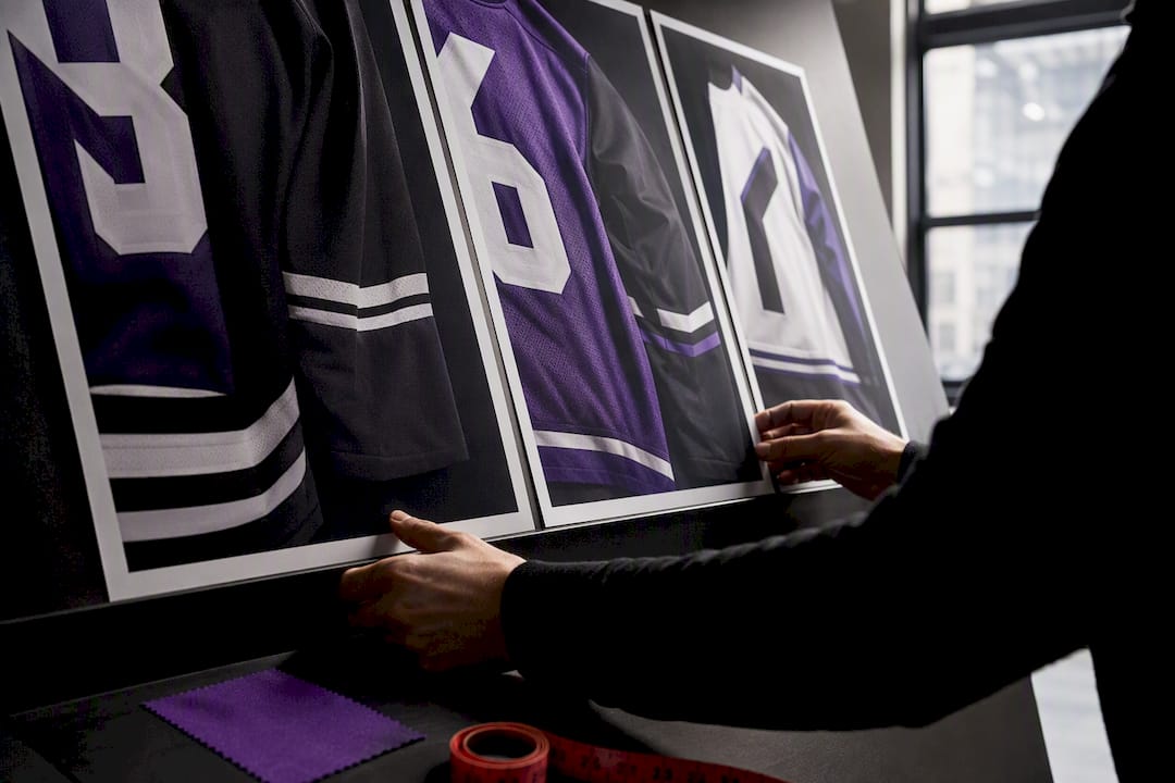
The best team jersey designs start with two dominant colors, one high-contrast number treatment, and a design tested on three different mockups before anyone commits to a bulk order. Skip the twelve-color fantasy draft. Pick your base, lock in contrast for numbers and names, and build three real mockups (bold, subtle, heritage) before you request a sample or place a bulk order.
TL;DR:
- Using two dominant colors, one high-contrast number, and testing three mockups ensures a balanced, recognizable jersey design suitable for team identity and printing methods.
- Simplify patterns by 20 to 30 percent for youth sizes to maintain clarity and avoid muddy visuals on smaller, movement-blurred jerseys.
- Sublimation offers the best detail and durability for complex graphics, fades, and full-color designs, while screen printing suits simple, flat-color patterns more cost-effectively.
- Testing mockups with different contrast, size, and fit on actual fabric helps prevent costly mistakes and ensures the jersey looks and functions as intended on game day.
- Keep key design elements consistent across home and away kits to preserve team identity, and consider sport-specific and positional requirements for visibility and fit.
Table of Contents
- Team Jersey Design Ideas by Category
- Design Principles That Make a Jersey Work
- Printing Methods and Fabric Choices That Shape Your Design
- How to Test Mockups Before You Commit
- Weaving Team Identity and History Into the Design
- Designing for Comfort and On-Field Performance
- Customization by Sport and Position
- Budgeting for Design and Production
- What We See Most Often on the Shop Floor
- Get Your Jersey Design Ready to Print
- Sources
Team Jersey Design Ideas by Category
Every strong jersey concept fits into a recognizable category, which is exactly why it works. Familiarity reads fast on a field or court, and fast reading means better team recognition from the sideline, the stands, and the group chat where someone is always asking “which one is Marcus again?”
Here are ten categories worth pulling from, with a production note for each:
- Classic and retro. Stripes, chest bands, and varsity-style block numbers borrow instant credibility from decades of sports history. Variant ideas: a throwback color combo from an old league logo, or a single retro stripe across the chest. Easy to screen print in flat colors; gets complex fast if you add gradient fading to the stripe.
- Minimalist. One dominant color, one accent, clean typography. This is the safest bet for teams that will wear the jersey well past game day. Variants: a single side-seam stripe, or a small wordmark on the sleeve instead of the chest. Cheap and fast across every print method.
- Heritage and crest-forward. Built around a shield or crest, often with a motto or founding year. Works well for school teams and long-running club programs. Variants: a monochrome crest for subtlety, or a full-color crest as the visual anchor. Detailed crests need sublimation or DTF to hold fine linework.
- Nature and landscape-inspired. Mountain ranges, wave patterns, or tree lines worked into the yoke or side panel. Strong for outdoor sports and regional teams. Variants: a horizon line at the waist, or a subtle topographic texture behind the number. Gradients here demand sublimation printing rather than screen print.
- Geometric and modern. Angular color blocks, chevrons, or diagonal splits. Reads as aggressive and current. Variants: a diagonal split at 15 degrees for motion, or a symmetric chevron on both sleeves. Straight lines and hard edges are screen-print friendly.
- Gradient and texture. Fades, camo, or subtle grain patterns that only full-color digital printing can reproduce cleanly. Variants: a fade from jersey color into black at the hem, or a faint texture overlay behind the crest. Sublimation and full-color DTF expand what’s possible here far beyond traditional screen printing.
- Mascot-driven. A mascot illustration front and center, or shrunk down as a sleeve detail. Great for youth and school teams where mascot pride runs deep. Variants: full mascot on the back, tiny mascot icon on the chest. Detailed illustrations print best with DTF for crisp edges at small scale.
- City silhouettes. Skyline outlines or local landmarks worked into a subtle background pattern. Strong for adult league and community teams with local identity. Variants: skyline along the hem, or a single landmark icon near the collar.
- Alternate or third kit. A deliberately different colorway from the home and away sets, often used for tournaments or rivalry games. Variants: inverted color scheme from the home kit, or an all-black “blackout” version.
- Goalkeeper-specific. Distinct colors and patterns required by most leagues so officials can tell keepers apart instantly. Variants: solid neon base with minimal graphics, or the team’s secondary color in a bold block pattern.
For youth sizing, simplify every pattern by roughly 20 to 30 percent in detail level. Small torsos compress artwork, and what reads as sharp texture on an adult large can turn muddy on a youth medium.
Design Principles That Make a Jersey Work
Professional designers keep coming back to the same short list of rules, and for good reason: simplicity and a two-color foundation consistently outperform busy, five-color concepts once you see the finished garment in motion.
- Two dominant colors, one accent. Aim for two main colors covering most of the shirt and a smaller accent for numbers or trim.
- Contrast drives readability. Numbers need at least a strong tonal jump from the base fabric color, sized large enough to read from the sideline, typically covering most of the back panel height.
- Patterns should scale. A pattern that looks sharp on a design mockup can blur or pixelate once it’s shrunk to fit a youth small, so test every pattern at your smallest size before approving it.
- Orientation changes perception. Vertical stripes read as taller and faster, horizontal bands read as sturdier, and diagonal cuts suggest motion. Pick the orientation that matches your team’s identity, not just what looks trendy.
- Home and away need a shared thread. Keep one consistent element, a crest position, a number font, a trim color, across both kits so the team still looks like one unit no matter which set is on the field.
Pro Tip: Hold your color swatches up against the actual playing surface, grass, hardwood, or gym wall, before finalizing. A jersey that looks sharp on a white background can disappear entirely against turf or blend into a wood-paneled gym floor.
Printing Methods and Fabric Choices That Shape Your Design
Your design ideas only matter if they can actually be produced the way you pictured them. Each printing method has a different ceiling for detail, color count, and durability.
- Sublimation dyes the fabric itself, which means gradients, fades, and photo-level detail print cleanly with zero texture or peeling risk. Best for full-color, edge-to-edge designs.
- DTF (direct-to-film) handles fine detail and small text well, including numbers and sponsor logos, and works on darker fabrics where sublimation struggles.
- Screen printing is the most cost-effective for simple, flat-color designs with two or three colors, but gets expensive fast once you add more color separations.
- Heat transfer vinyl works well for single-color numbers and names but isn’t practical for large, detailed graphics.
Fabric matters just as much as method. Moisture-wicking polyester holds sublimation ink well and keeps detail crisp. Mesh panels breathe better but can distort fine patterns at the weave. CVC blends (cotton/poly) feel softer against skin but mute sharp color transitions slightly compared to pure polyester.
Seam placement deserves early attention too: keep crests and numbers off seam lines, and avoid pocketing busy patterns right where side seams will pull the fabric tight during a sprint or a swing.
Repeated washing and drying cycles fade screen-printed ink faster than sublimated designs, since sublimation becomes part of the fabric rather than sitting on top of it, so factor expected wash frequency into which method you choose for a season-long uniform.
How to Test Mockups Before You Commit
A proper jersey process moves from concept to colors to numbers and sponsor placement, then into production planning, and skipping straight to a bulk order without testing that sequence is the single most common regret team managers report.
- Build three mockups. One bold version, one subtle version, one heritage-leaning version. Comparing three side by side reveals which direction the team actually prefers, rather than guessing from a single option.
- Run the review checklist. Check number contrast at a 20-foot distance, confirm the crest has clear space around it, verify no graphic crosses a seam awkwardly, and scale everything down to your smallest youth size to check legibility.
- Order one sample first. Wash it, wear it, sweat in it if you can. Confirm color fidelity and print durability before committing to 30 jerseys.
- Decide with a short checklist. Comfort, readability, production feasibility, and whether the whole team actually likes it, in that order.
3D configurators and live preview tools speed this whole process up by showing the graphic on the actual garment cut instead of a flat template, which cuts down on proofing surprises later.
Pro Tip: Ask two or three players outside your inner circle to react to the mockups before you finalize anything. The people who will actually wear the jersey every week often spot a readability problem the designer missed.
Weaving Team Identity and History Into the Design
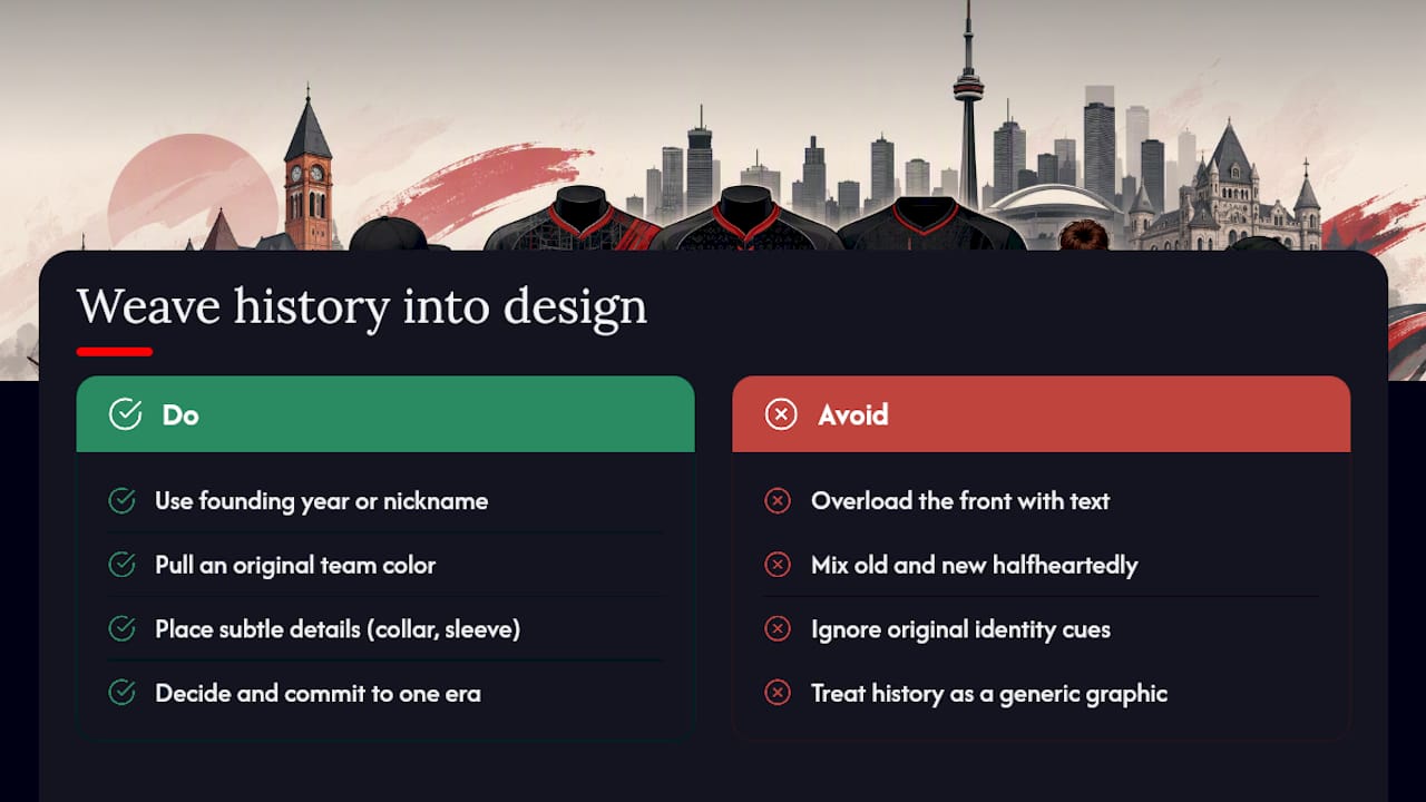
A jersey that reflects real team history tends to get worn long after the season ends, and that outside-the-locker-room wear is exactly what keeps a design effective and worth the reprint cost year after year.
Start with the team’s founding year, a nickname that already sticks, or a color combination tied to a school, sponsor, or community. A recreational softball league founded in 1987 has more design equity in that year than in any generic sunburst graphic. Small details carry weight: a founding year stitched into the collar, a motto worked into the sleeve, a color pulled from the original uniform even if the rest of the design has modernized.
History doesn’t mean cluttering the front with text. It usually works best as a quiet detail, a number style borrowed from an old roster photo, a crest shape that echoes the original team logo, rather than a loud centerpiece. The goal is a design that current players are proud to wear and former players recognize instantly.
If your team has gone through a rebrand, a merger, or a name change, decide early whether the new jersey should bridge both eras or fully break from the old one. Either choice works, but an accidental in-between, half old logo, half new color scheme, usually reads as unresolved rather than intentional.
Designing for Comfort and On-Field Performance
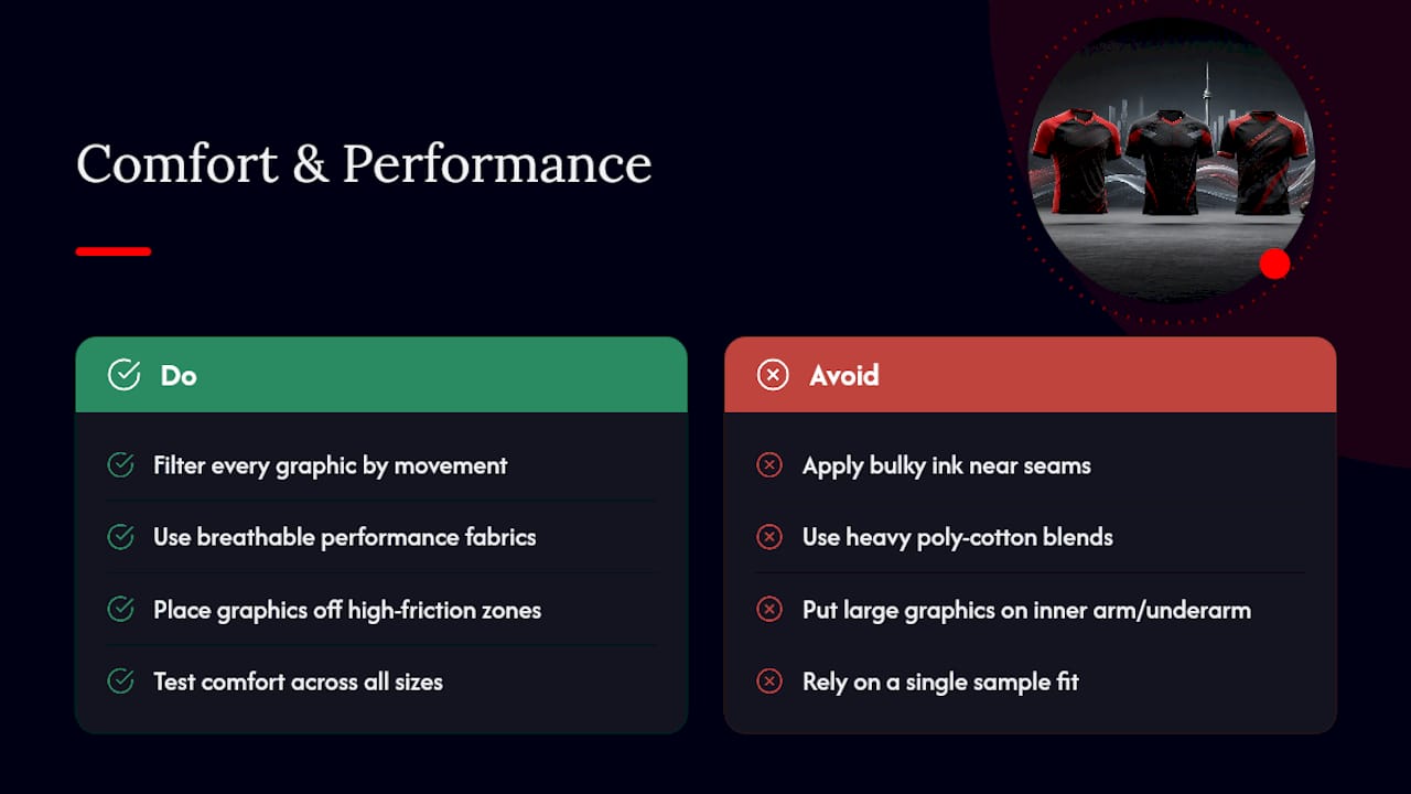
Every graphic decision should get filtered through one question: does this get in the way of how the athlete moves? Bulky ink buildup near the underarm seam, the collar, or the side panel can chafe during a full game, especially with heavier screen-print ink layers.
Breathable fabric choices matter more than most first-time designers expect. A jersey that looks sharp in a flat mockup but uses a heavy poly-cotton blend can trap heat during a summer tournament. Performance fabrics built for athletic wear move sweat away from skin and hold up better across a full season of practices and games than standard cotton tees repurposed as jerseys.
Placement matters as much as fabric. Keep large graphic elements off high-friction zones, the inner arm, the underarm, and anywhere fabric folds during a full range of motion like a pitching windup or a jump shot. A design that wraps cleanly around the torso without interrupting movement will always outperform a busier design that looks better only when the athlete is standing still.
For teams ordering youth sizes alongside adult sizes, remember that younger athletes move differently and often wear looser fits, so test comfort across your full size range, not just the sample you tried on yourself.
Customization by Sport and Position
Football, basketball, baseball, hockey, and soccer each have different visibility needs, and a design that works for one sport can fail on another entirely.
Basketball jerseys need large, high-contrast numbers readable from the top row of bleachers, since there’s no name-on-back convention in most amateur leagues to help with identification. Soccer and hockey jerseys carry more real estate for crest placement and sponsor logos, but goalkeepers in soccer specifically need a color and pattern distinct enough that referees can identify them instantly, a rule most leagues enforce strictly. Baseball uniforms tend to favor traditional piping and classic typography over bold modern graphics, reflecting the sport’s own visual history.
Position also shapes practical choices beyond visibility. Linemen in football need roomier cuts through the shoulders that shouldn’t distort a chest logo when the fabric stretches. Pitchers and catchers in baseball benefit from moisture-wicking performance fabric more than a mesh-heavy design built for outfielders who need airflow. Point guards and forwards in basketball may want a slightly more tailored fit than centers, whose uniforms see more contact and stretching under the arms.
Match the customization to the sport’s actual playing conditions, not just its general aesthetic. A design built for a fast-break basketball game and one built for a slow-paced golf team have almost nothing in common structurally, even if both start from the same blank template.
Budgeting for Design and Production
Jersey costs break down into three buckets: design work, print method, and order volume, and each one moves the total in a different direction. A simple two-color screen-printed design with a single number style will always cost less per unit than a full-color sublimated jersey with gradients and a custom crest.
Order volume matters more than most first-time team managers expect. Bulk pricing tiers usually kick in around 12 to 24 units and again at higher thresholds, so a league coordinating two teams together for a combined order often lands a noticeably better per-unit rate than each team ordering separately. If your budget is tight, prioritize spending on the print method for the number and crest, since that’s what everyone actually looks at, and save on the base garment fabric.
Rush orders typically carry a premium, so locking in your final mockup two to three weeks before the season starts avoids paying extra for speed. Sample runs add a small upfront cost but prevent the far more expensive mistake of discovering a color or fit problem after 30 jerseys have already shipped. Build that sample cost into your budget from the start rather than treating it as optional.
What We See Most Often on the Shop Floor
Most teams that come to us with a “finished” design still need one fix: better contrast on the numbers. It’s the single most common revision request after a first sample. Our advice stays the same every time: pick two colors you’d wear off the field, then test them against real fabric before you commit to a full team order.
— Toronto
Get Your Jersey Design Ready to Print
Once you’ve settled on colors, contrast, and a category that fits your team, the next step is turning that concept into a real garment without guessing whether it’ll print the way you imagined. Torontocustomtshirts handles that gap directly: full-color DTF and sublimation-ready printing, live design previews before anything goes to production, sample runs so you can check fit and color fidelity, and rush turnaround when your season starts sooner than your design process finished.
We work with youth and adult sizing on the same order, which matters if your league spans multiple age groups, and local pickup is available in Mississauga for teams that want to skip shipping delays entirely. Start with a single customized jersey tee to test your design, or head straight to a bulk order quote if your team is ready to move from mockup to full roster. Either way, request your quote now and get a proof back before you commit to a full run.
Sources
- Team Jersey Design Tips | Expert Advice for Standout Sports Kits | OnReplay
- Team T-shirt Designs - 28+ Team T-shirt Ideas in 2026 | 99designs
Recommended
Get pricing in 24h.
Toronto-based, no minimums. Tell us about your project and we'll email a detailed quote within one business day.
Request a Quote